3 Summarizing data
3.1 Summary statistics
This section discusses how to produce and analyse basic summary statistics. We make a distinction between categorical and continuous variables, for which different statistics are permissible.
You can download the corresponding R-Code here
| OK to compute…. | Nominal | Ordinal | Interval | Ratio |
|---|---|---|---|---|
| frequency distribution | Yes | Yes | Yes | Yes |
| median and percentiles | No | Yes | Yes | Yes |
| mean, standard deviation, standard error of the mean | No | No | Yes | Yes |
| ratio, or coefficient of variation | No | No | No | Yes |
As an example data set, we will be using the MRDA course survey data. Let’s load and inspect the data first.
test_data <- read.table("https://raw.githubusercontent.com/IMSMWU/Teaching/master/MRDA2017/survey2017.dat",
    sep = "\t", header = TRUE)
head(test_data)
3.1.1 Categorical variables
Categorical variables contain a finite number of categories or distinct groups and are also known as qualitative variables. There are different types of categorical variables:
- Nominal variables: variables that have two or more categories but no logical order (e.g., music genres). A dichotomous variables is simply a nominal variable that only has two categories (e.g., gender).
- Ordinal variables: variables that have two or more categories that can also be ordered or ranked (e.g., income groups).
For this example, we are interested in the following two variables
- “overall_knowledge”: measures the self-reported prior knowledge of marketing students in statistics before taking the marketing research class on a 5-point scale with the categories “none”, “basic”, “intermediate”,“advanced”, and “proficient”.
- “gender”: the gender of the students (1 = male, 2 = female)
In a first step, we convert the variables to factor variables using the factor() function to assign appropriate labels according to the scale points:
test_data$overall_knowledge_cat <- factor(test_data$overall_knowledge,
    levels = c(1:5), labels = c("none", "basic", "intermediate",
        "advanced", "proficient"))
test_data$gender_cat <- factor(test_data$gender, levels = c(1:2),
    labels = c("male", "female"))
The table() function creates a frequency table. Let’s start with the number of occurrences of the categories associated with the prior knowledge and gender variables separately:
##
##         none        basic intermediate     advanced   proficient
## 10 32 9 4 0##
## male female
## 14 41It is obvious that there are more female than male students. For variables with more categories, it might be less obvious and we might compute the median category using the median() function, or the summary() function, which produces further statistics.
## [1] 2## Min. 1st Qu. Median Mean 3rd Qu. Max.
## 1.000 2.000 2.000 2.127 2.000 4.000Often, we are interested in the relative frequencies, which can be obtained by using the prop.table() function.
##
##         none        basic intermediate     advanced   proficient
## 0.18181818 0.58181818 0.16363636 0.07272727 0.00000000##
## male female
## 0.2545455 0.7454545Now let’s investigate if the prior knowledge differs by gender. To do this, we simply apply the table() function to both variables:
##                      gender_cat
## overall_knowledge_cat male female
##          none            1      9
##          basic           8     24
##          intermediate    4      5
##          advanced        1      3
##          proficient      0      0
Again, it might be more meaningful to look at the relative frequencies using prop.table():
##                      gender_cat
## overall_knowledge_cat       male     female
##          none         0.01818182 0.16363636
##          basic        0.14545455 0.43636364
##          intermediate 0.07272727 0.09090909
##          advanced     0.01818182 0.05454545
##          proficient   0.00000000 0.00000000
Note that the above output shows the overall relative frequencies when male and female respondents are considered together. In this context, it might be even more meaningful to look at the conditional relative frequencies. This can be achieved by adding a ,2 to the prop.table() command, which tells R to compute the relative frequencies by the columns (which is in our case the gender variable):
prop.table(table(test_data[, c("overall_knowledge_cat",
    "gender_cat")]), 2)  #conditional relative frequencies
## gender_cat
## overall_knowledge_cat male female
## none 0.07142857 0.21951220
## basic 0.57142857 0.58536585
## intermediate 0.28571429 0.12195122
## advanced 0.07142857 0.07317073
## proficient 0.00000000 0.000000003.1.2 Continuous variables
3.1.2.1 Descriptive statistics
Continuous variables are numeric variables that can take on any value on a measurement scale (i.e., there is an infinite number of values between any two values). There are different types of continuous variables:
- Interval variables: while the zero point is arbitrary, equal intervals on the scale represent equal differences in the property being measured. E.g., on a temperature scale measured in Celsius the difference between a temperature of 15 degrees and 25 degrees is the same difference as between 25 degrees and 35 degrees but the zero point is arbitrary.
- Ratio variables: has all the properties of an interval variable, but also has an absolute zero point. When the variable equals 0.0, it means that there is none of that variable (e.g., number of products sold, willingness-to-pay, mileage a car gets).
Computing descriptive statistics in R is easy and there are many functions from different packages that let you calculate summary statistics (including the summary() function from the base package). In this tutorial, we will use the describe() function from the psych package:
##             vars  n    mean       sd median trimmed   mad min    max  range
## duration       1 55 4977.16 33672.62    237  271.20 93.40 107 250092 249985
## overall_100    2 55   39.18    20.43     40   38.89 29.65   0     80     80
##             skew kurtosis      se
## duration    7.01    48.05 4540.41
## overall_100 0.12    -1.13    2.75
In the above command, we used the psych:: prefix to avoid confusion and to make sure that R uses the describe() function from the psych package since there are many other packages that also contain a desribe() function. Note that you could also compute these statistics separately by using the respective functions (e.g., mean(), sd(), median(), min(), max(), etc.).
The psych package also contains the describeBy() function, which lets you compute the summary statistics by sub-group separately. For example, we could easily compute the summary statistics by gender as follows:
##
##  Descriptive statistics by group
## group: male
##             vars  n     mean       sd median trimmed    mad min    max  range
## duration       1 14 18073.86 66779.48  238.5  236.25 132.69 107 250092 249985
## overall_100    2 14    43.93    18.52   42.5   44.17  18.53  10     75     65
##             skew kurtosis       se
## duration    2.98     7.41 17847.57
## overall_100 0.00    -1.19     4.95
## ------------------------------------------------------------
## group: female
##             vars  n   mean     sd median trimmed   mad min  max range skew
## duration       1 41 505.12 906.32    237  283.42 93.40 114 4735  4621 3.70
## overall_100    2 41  37.56  21.01     30   36.97 22.24   0   80    80 0.21
##             kurtosis     se
## duration       13.09 141.54
## overall_100    -1.17   3.28
Note that you could just as well use other packages to compute the descriptive statistics. For example, you could have used the stat.desc() function from the pastecs package:
##                       duration  overall_100
## nbr.val              55.000000   55.0000000
## nbr.null              0.000000    1.0000000
## nbr.na                0.000000    0.0000000
## min                 107.000000    0.0000000
## max              250092.000000   80.0000000
## range            249985.000000   80.0000000
## sum              273744.000000 2155.0000000
## median              237.000000   40.0000000
## mean               4977.163636   39.1818182
## SE.mean            4540.414684    2.7547438
## CI.mean.0.95       9102.983359    5.5229288
## var          1133845102.435690  417.3737374
## std.dev           33672.616507   20.4297268
## coef.var              6.765423    0.5214083
Computing statistics by group is also possible by using the wrapper function by(). Within the function, you first specify the data on which you would like to perform the grouping test_data[,c("duration", "overall_100")], followed by the grouping variable test_data$gender_cat and the function that you would like to execute (e.g., stat.desc()):
## test_data$gender_cat: male
##                       duration overall_100
## nbr.val              14.000000   14.000000
## nbr.null              0.000000    0.000000
## nbr.na                0.000000    0.000000
## min                 107.000000   10.000000
## max              250092.000000   75.000000
## range            249985.000000   65.000000
## sum              253034.000000  615.000000
## median              238.500000   42.500000
## mean              18073.857143   43.928571
## SE.mean           17847.566755    4.949708
## CI.mean.0.95      38557.323811   10.693194
## var          4459498946.901099  342.994505
## std.dev           66779.479984   18.520111
## coef.var              3.694811    0.421596
## ------------------------------------------------------------
## test_data$gender_cat: female
##                   duration overall_100
## nbr.val          41.000000   41.000000
## nbr.null          0.000000    1.000000
## nbr.na            0.000000    0.000000
## min             114.000000    0.000000
## max            4735.000000   80.000000
## range          4621.000000   80.000000
## sum           20710.000000 1540.000000
## median          237.000000   30.000000
## mean            505.121951   37.560976
## SE.mean         141.543022    3.281145
## CI.mean.0.95    286.069118    6.631442
## var          821411.509756  441.402439
## std.dev         906.317555   21.009580
## coef.var          1.794255    0.559346
These examples are meant to exemplify that there are often many different ways to reach a goal in R. Which one you choose depends on what type of information you seek (the results provide slightly different information) and on personal preferences.
3.1.2.2 Creating subsets
From the above statistics it is clear that the data set contains some severe outliers on some variables. For example, the maximum duration is 2.9 days. You might want to investigate these cases and delete them if they would turn out to indeed induce a bias in your analyses. For normally distributed data, any absolute standardized deviations larger than 3 standard deviations from the mean are suspicious. Let’s check if potential outliers exist in the data:
library(dplyr)
test_data %>% mutate(duration_std = as.vector(scale(duration))) %>%
    filter(abs(duration_std) > 3)
## startdate enddate ipaddress duration experience theory_ht
## 1 11.09.2017 16:15 14.09.2017 13:43 86.56.146.66 250092 1 3
## theory_anova theory_reg theory_fa pract_ht pract_anova pract_reg pract_fa
## 1 3 2 1 4 4 3 2
## overall_knowledge multi_1 multi_2 multi_3 multi_4 overall_100 prior_SPSS
## 1 3 4 4 3 2 55 3
## prior_R prior_Stata prior_Excel prior_SAS software_preference
## 1 1 1 2 1 1
## future_importance gender country group lat long
## 1 4 1 1 2 48.20869 16.24071
## overall_knowledge_cat gender_cat duration_std
## 1 intermediate male 7.279352Indeed, there appears to be one potential outlier, which we may wish to exclude before we start fitting models to the data. You could easily create a subset of the original data, which you would then use for estimation using the filter() function from the dplyr() package. For example, the following code creates a subset that excludes all cases with a standardized duration of more than 3:
library(dplyr)
estimation_sample <- test_data %>% mutate(duration_std = as.vector(scale(duration))) %>%
    filter(abs(duration_std) < 3)
psych::describe(estimation_sample[, c("duration", "overall_100")])
## vars n mean sd median trimmed mad min max range skew
## duration 1 54 438.00 797.83 235.5 261.45 91.18 107 4735 4628 4.35
## overall_100 2 54 38.89 20.50 37.5 38.52 25.95 0 80 80 0.16
## kurtosis se
## duration 18.77 108.57
## overall_100 -1.12 2.793.2 Data visualization
This section discusses how to produce appropriate graphics to describe our data visually. While R includes tools to build plots, we will be using the ggplot2 package by Hadley Wickham. It has the advantage of being fairly straightforward to learn but being very flexible when it comes to building more complex plots. For a more in depth discussion you can refer to chapter 4 of the book “Discovering Statistics Using R” by Andy Field et al. or read the following chapter from the book “R for Data science” by Hadley Wickham as well as “R Graphics Cookbook” by Winston Chang.
You can download the corresponding R-Code here
ggplot2 is built around the idea of constructing plots by stacking layers on top of one another. Every plot starts with the ggplot(data) function, after which layers can be added with the “+” symbol. The following figures show the layered structure of creating plots with ggplot.


3.2.1 Categorical variables
3.2.1.1 Bar plot
To give you an example of how the graphics are composed, let’s go back to the frequency table from the previous chapter, where we created this table:
test_data <- read.table("https://raw.githubusercontent.com/IMSMWU/Teaching/master/MRDA2017/survey2017.dat",
    sep = "\t", header = TRUE)
head(test_data)test_data$overall_knowledge_cat <- factor(test_data$overall_knowledge,
levels = c(1:5), labels = c("none", "basic", "intermediate",
"advanced", "proficient"))
test_data$gender_cat <- factor(test_data$gender, levels = c(1:2),
labels = c("male", "female"))How can we plot this kind of data? Since we have a categorical variable, we will use a bar plot. However, to be able to use the table for your plot, you first need to assign it to an object as a data frame using the as.data.frame()-function.
table_plot_rel <- as.data.frame(prop.table(table(test_data[,
    c("overall_knowledge_cat")])))  #relative frequencies
head(table_plot_rel)
Since Var1 is not a very descriptive name, let’s rename the variable to something more meaningful
library(plyr)
table_plot_rel <- plyr::rename(table_plot_rel, c(Var1 = "overall_knowledge"))
head(table_plot_rel)
Once we have our data set we can begin constructing the plot. As mentioned previously, we start with the ggplot() function, with the argument specifying the data set to be used. Within the function, we further specify the scales to be used using the aesthetics argument, specifying which variable should be plotted on which axis. In our example, we would like to plot the categories on the x-axis (horizontal axis) and the relative frequencies on the y-axis (vertical axis).
library(ggplot2)
bar_chart <- ggplot(table_plot_rel, aes(x = overall_knowledge,
    y = Freq))
bar_chart
Figure 3.1: Bar chart (step 1)
You can see that the coordinate system is empty. This is because so far, we have told R merely which variables we would like to plot but we haven’t specified which geometric figures (points, bars, lines, etc.) we would like to use. This is done using the geom_xxx function. ggplot includes many different geoms, for a wide range of plots (e.g., geom_line, geom_histogram, geom_boxplot, etc.). A good overview of the various geom functions can be found here. In our case, we would like to use a bar chart for which geom_col is appropriate.

Figure 3.2: Bar chart (step 2)
Note that the same could be achieved using geom_bar. However, by default geom_bar counts the number of observations within each category of a variable. This is not required in our case because we have already used the prop.table() function to compute the relative frequencies. The argument stat = "identity" prevents geom_bar from performing counting operations and uses it “as it is”.

Figure 3.3: Bar chart (alternative specification)
Now we have specified the data, the scales and the shape. Specifying this information is essential for plotting data using ggplot. Everything that follow now just serves the purpose of making the plot look nicer by modifying the appearance of the plot. How about some more meaningful axis labels? We can specify the axis labels using the ylab() and xlab() functions:

Figure 3.4: Bar chart (step 3)
How about adding some value labels to the bars? This can be done using geom_text(). Note that the sprintf() function is not mandatory and is only added to format the numeric labels here. The function takes two arguments: the first specifies the format wrapped in two % sings. Thus, %.0f means to format the value as a fixed point value with no digits after the decimal point, and %% is a literal that prints a “%” sign. The second argument is simply the numeric value to be used. In this case, the relative frequencies multiplied by 100 to obtain the percentage values. Using the vjust = argument, we can adjust the vertical alignment of the label. In this case, we would like to display the label slightly above the bars.
bar_chart + geom_col() + ylab("Relative frequency") +
xlab("Overall Knowledge") + geom_text(aes(label = sprintf("%.0f%%",
Freq/sum(Freq) * 100)), vjust = -0.2)
Figure 3.5: Bar chart (step 4)
We could go ahead and specify the appearance of every single element of the plot now. However, there are also pre-specified themes that include various formatting steps in one singe function. For example theme_bw() would make the plot appear like this:
bar_chart + geom_col() + ylab("Relative frequency") +
    xlab("Overall Knowledge") + geom_text(aes(label = sprintf("%.0f%%",
Freq/sum(Freq) * 100)), vjust = -0.2) + theme_bw()
Figure 3.6: Bar chart (step 5)
and theme_minimal() looks like this:
bar_chart + geom_col() + ylab("Relative frequency") +
    xlab("Overall Knowledge") + geom_text(aes(label = sprintf("%.0f%%",
    Freq/sum(Freq) * 100)), vjust = -0.2) + theme_minimal()
Figure 3.7: Bar chart (options 1)
These were examples of built-in formations of ggolot(), where the default is theme_classic(). For even more options, check out the ggthemes package, which includes formats for specific publications. You can check out the different themes here. For example theme_economist() uses the formatting of the journal “The Economist”:
library(ggthemes)
bar_chart + geom_col() + ylab("Relative frequency") +
    xlab("Overall Knowledge") + theme_economist()
Figure 3.8: Bar chart (options 2)
Summary
To create a plot with ggplot we give it the appropriate data (in the ggplot() function), tell it which shape to use (via a function of the geom family), assign variables to the correct axis (by using the the aes() function) and define the appearance of the plot.
Now we would like to investigate whether the distribution differs between male and female students. For this purpose we first construct the conditional relative frequency table from the previous chapter again. Recall that the latter gives us the relative frequency within a group (in our case male and female), as compared to the relative frequency within the entire sample.
table_plot_cond_rel <- as.data.frame(prop.table(table(test_data[,
    c("overall_knowledge_cat", "gender_cat")]), 2))  #conditional relative frequencies
We can now take these tables to construct plots grouped by gender. To achieve this we simply need to add the facet_wrap() function, which replicates a plot multiple times, split by a specified grouping factor. Note that the grouping factor has to be supplied in R’s formula notation, hence it is preceded by a “~” symbol.
ggplot(table_plot_cond_rel, aes(x = overall_knowledge_cat,
    y = Freq)) + geom_col() + facet_wrap(~gender_cat) +
    ylab("Conditional relative frequency") + xlab("Overall Knowledge") +
    theme_bw()
Figure 3.9: Grouped bar chart (conditional relative frequencies)
To plot the relative frequencies for each response category by group in a slightly different way, we can also use the fill argument, which tells ggplot to fill the bars by a specified variable (in our case “gender”). The position = "dodge" argument causes the bars to be displayed next to each other (as opposed to stacked on top of one another).
ggplot(table_plot_cond_rel, aes(x = overall_knowledge_cat, y = Freq, fill = gender_cat)) + #use "fill" argument for different colors
  geom_col(position = "dodge") + #use "dodge" to display bars next to each other (instead of stacked on top)
  geom_text(aes(label = sprintf("%.0f%%", Freq/sum(Freq) * 100)),position=position_dodge(width=0.9), vjust=-0.25) +
  ylab("Conditional relative frequency") +
  xlab("Overall Knowledge") +
theme_bw() 
Figure 3.10: Grouped bar chart (conditional relative frequencies) (2)
3.2.1.2 Covariation plots
To visualize the covariation between categorical variables, you’ll need to count the number of observations for each combination stored in the frequency table. Let’s use a different example. Say, we wanted to investigate the association between prior theoretical and prior practical knowledge in regression analysis. First, we need to make sure that the respective variables are coded as factors.
test_data$Theory_Regression_cat <- factor(test_data$theory_reg,
    levels = c(1:5), labels = c("none", "basic", "intermediate",
        "advanced", "proficient"))

test_data$Practice_Regression_cat <- factor(test_data$pract_reg,
    levels = c(1:5), labels = c("Definitely not", "Probably not",
        "Might or might not", "Probably yes", "Definitely yes"))
There are multiple ways to visualize such a relationship with ggplot. One option would be to use a variation of the scatterplot which counts how many points overlap at any given point and increases the dot size accordingly. This can be achieved with geom_count().
ggplot(data = test_data) + geom_count(aes(x = Theory_Regression_cat,
    y = Practice_Regression_cat)) + ylab("Practical knowledge") +
    xlab("Theoretical knowledge") + theme_bw()
Figure 3.11: Covariation between categorical data (1)
Another option would be to use a tile plot that changes the color of the tile based on the frequency of the combination of factors. To achieve this we first to have create a dataframe that contains the absolute frequencies of all combinations of factors. Then we can take this dataframe and supply it to geom_tile(), while specifying that the fill of each tile should be dependent on the observed frequency of the factor combination, which is done by specifying the fill in the aes() function.
table_plot_abs_reg <- as.data.frame(table(test_data[,
    c("Theory_Regression_cat", "Practice_Regression_cat")]))  #absolute frequencies

ggplot(table_plot_abs_reg, aes(x = Theory_Regression_cat,
    y = Practice_Regression_cat)) + geom_tile(aes(fill = Freq)) +
    ylab("Practical knowledge") + xlab("Theoretical knowledge") +
    theme_bw()
Figure 3.12: Covariation between categorical data (2)
3.2.2 Continuous variables
3.2.2.1 Histogram
Histograms can be plotted for continuous data using the geom_histogram() function. Note that the aes() function only needs one argument here, since a histogram is a plot of the distribution of only one variable. As an example, let’s consider a data set containing the advertising expenditures and product sales of a company selling products in two different stores:
adv_data <- read.table("https://raw.githubusercontent.com/IMSMWU/Teaching/master/MRDA2017/advertising_sales.dat",
    sep = "\t", header = TRUE)

adv_data$store <- factor(adv_data$store, levels = c(1:2),
    labels = c("store1", "store2"))

head(adv_data)
Now we can create the histogram using geom_histogram(). The argument binwidth specifies the range that each bar spans, col = "black" specifies the border to be black and fill = "darkblue" sets the inner color of the bars to dark blue. For brevity, we have now also started naming the x and y axis with the single function labs(), instead of using the two distinct functions xlab() and ylab().
ggplot(adv_data, aes(sales)) + geom_histogram(binwidth = 3000,
    col = "black", fill = "darkblue") + labs(x = "Number of sales",
    y = "Frequency") + theme_bw()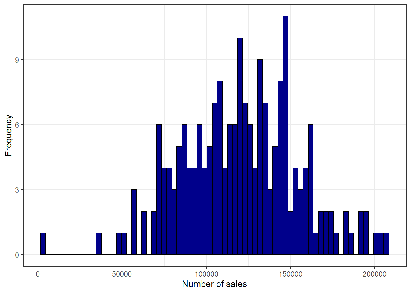
Figure 3.13: Histogram
3.2.2.2 Boxplot
Another common way to display the distribution of continuous variables is through boxplots. ggplot will construct a boxplot if given the geom geom_boxplot(). In our case we want to show the difference in distribution between the two stores in our sample, which is why the aes() function contains both an x and a y variable.
ggplot(adv_data, aes(x = store, y = sales)) + geom_boxplot() +
    labs(x = "Store ID", y = "Number of sales") + theme_bw()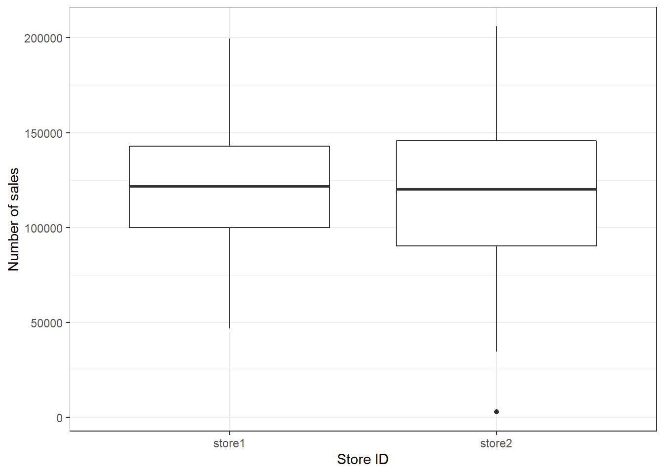
Figure 3.14: Boxplot by group
The following graphic shows you how to interpret the boxplot:

Information contained in a Boxplot
You may also augment the boxplot with the data points using geom_jitter():
ggplot(adv_data, aes(x = store, y = sales)) + geom_boxplot() +
    geom_jitter(colour = "red", alpha = 0.2) + labs(x = "Store ID",
    y = "Number of sales") + theme_bw()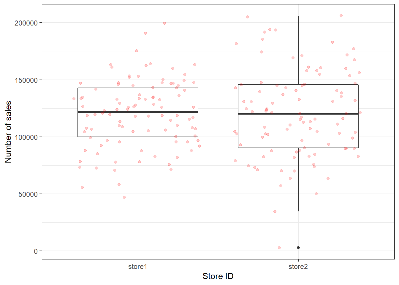
Figure 3.15: Boxplot with augmented data points
In case you would like to create the boxplot on the total data (i.e., not by group), just leave the x = argument within the aes() function empty:
ggplot(adv_data, aes(x = "", y = sales)) + geom_boxplot() +
    labs(x = "Total", y = "Number of sales") + theme_bw()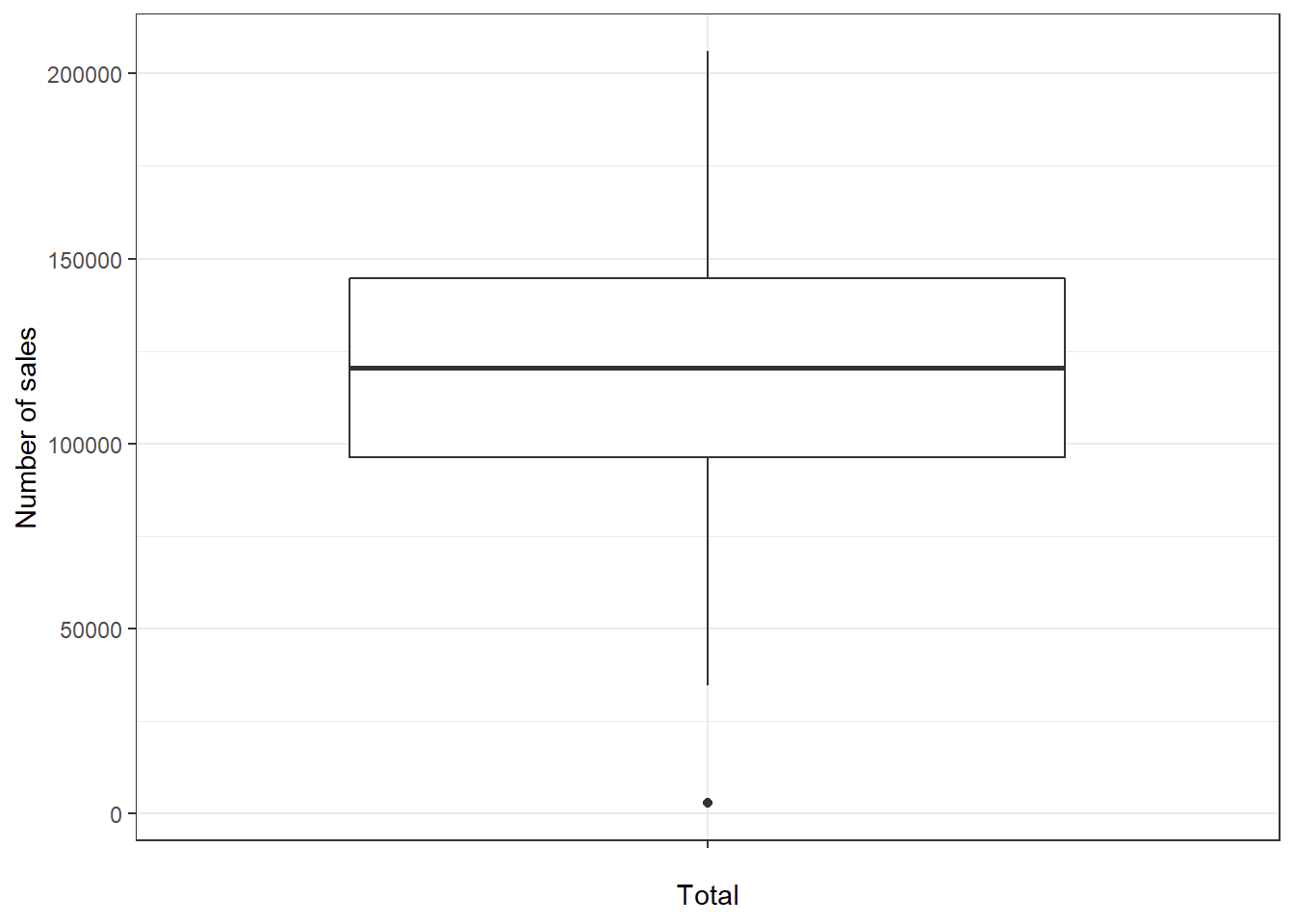
Figure 3.16: Single Boxplot
3.2.2.3 Plot of means
Another quick way to get an overview of the difference between two groups is to plot their respective means with confidence intervals. Two things about this plot are new. First, there are now two geoms included in the same plot. This is one of the big advantages of ggplot’s layered approach to graphs, the fact that new elements can be drawn by simply adding a new line with a new geom function. In this case we want to add confidence bounds to our plot, which we achieve by adding a geom_pointrange() layer. Recall that if the interval is small, the sample must be very close to the population and when the interval is wide, the sample mean is likely very different from the population mean and therefore a bad representation of the population. Second, we are using an additional argument in geom_bar(), namely stat =, which is short for statistical transformation. Every geom uses such a transformation in the background to adapt the data to be able to create the desired plot. geom_bar() typically uses the count stat, which would create a similar plot to the one we saw at the very beginning, counting how often a certain value of a variable appears. By telling geom_bar() explicitly that we want to use a different stat we can override its behavior, forcing it to create a bar plot of the means.
ggplot(adv_data, aes(store, sales)) + geom_bar(stat = "summary",
    color = "black", fill = "white", width = 0.7) +
    geom_pointrange(stat = "summary") + labs(x = "Store ID",
    y = "Average number of sales") + coord_cartesian(ylim = c(100000,
    130000)) + theme_bw()
Figure 3.17: Plot of means
3.2.2.4 Scatter plot
The most common way to show the relationship between two continuous variables is a scatterplot. The following code creates a scatterplot with some additional components. The geom_smooth() function creates a smoothed line from the data provided. In this particular example we tell the function to draw the best possible straight line (i.e., minimizing the distance between the line and the points) through the data (via the argument method = "lm"). The “fill” and “alpha” arguments solely affect appearance, in our case the color and the opacity of the confidence interval, respectively.
ggplot(adv_data, aes(advertising, sales)) + geom_point() +
    geom_smooth(method = "lm", fill = "blue", alpha = 0.1) +
    labs(x = "Advertising expenditures (EUR)", y = "Number of sales",
        colour = "store") + theme_bw()
Figure 3.18: Scatter plot
As you can see, there appears to be a positive relationship between advertising and sales.
3.2.2.4.1 Grouped scatter plot
It could be that customers from different store respond differently to advertising. We can visually capture such differences with a grouped scatter plot. By adding the argument colour = store to the aesthetic specification, ggplot automatically treats the two stores as distinct groups and plots accordingly.
ggplot(adv_data, aes(advertising, sales, colour = store)) +
    geom_point() + geom_smooth(method = "lm", alpha = 0.1) +
    labs(x = "Advertising expenditures (EUR)", y = "Number of sales",
        colour = "store") + theme_bw()
Figure 3.19: Grouped scatter plot
It appears from the plot that customers in store 1 are more responsive to advertising.
3.2.2.4.2 Combination of scatter plot and histogram
Using the ggExtra() package, you may also augment the scatterplot with a histogram:
library(ggExtra)
p <- ggplot(adv_data, aes(advertising, sales)) + geom_point() +
    labs(x = "Advertising expenditures (EUR)", y = "Number of sales",
        colour = "store") + theme_bw()
ggExtra::ggMarginal(p, type = "histogram")
Figure 3.20: Scatter plot with histogram
In this case, the type = "histogram" argument specifies that we would like to plot a histogram. However, you could also opt for type = "boxplot" or type = "density" to use a boxplot or density plot instead.
3.2.2.5 Line plot
Another important type of plot is the line plot used if, for example, you have a variable that changes over time and you want to plot how it develops over time. To demonstrate this we first gather the population of Austria from the world bank API (as we did previously).
library(jsonlite)
# specifies url
url <- "http://api.worldbank.org/countries/AT/indicators/SP.POP.TOTL/?date=1960:2016&format=json&per_page=100"
ctrydata_at <- fromJSON(url)  #parses the data
head(ctrydata_at[[2]][, c("value", "date")])  #checks if we scraped the desired data
ctrydata_at <- ctrydata_at[[2]][, c("date", "value")]
ctrydata_at$value <- as.numeric(ctrydata_at$value)
ctrydata_at$date <- as.integer(ctrydata_at$date)
str(ctrydata_at)## 'data.frame': 57 obs. of 2 variables:
## $ date : int 2016 2015 2014 2013 2012 2011 2010 2009 2008 2007 ...
## $ value: num 8736668 8642699 8546356 8479823 8429991 ...As you can see doing this is very straightforward. Given the correct aes() and geom specification ggplot constructs the correct plot for us.
ggplot(ctrydata_at, aes(x = date, y = value)) + geom_line() +
    labs(x = "Year", y = "Population of Austria") +
    theme_bw()
Figure 3.21: Line plot
3.2.3 Saving plots
To save the last displayed plot, simply use the function ggsave(), and it will save the plot to your working directory. Use the arguments heightand width to specify the size of the file. You may also choose the file format by adjusting the ending of the file name. E.g., file_name.jpg will create a file in JPG-format, whereas file_name.png saves the file in PNG-format, etc..
3.2.4 Additional options
Now that we have covered the most important plots, we can look at what other type of data you may come across. One type of data that is increasingly available is the geo-location of customers and users (e.g., from app usage data). The following data set contains the app usage data of Shazam users from Germany. The data contains the latitude and longitude information where a music track was “shazamed”.
library(ggmap)
library(dplyr)
geo_data <- read.table("https://raw.githubusercontent.com/IMSMWU/Teaching/master/MRDA2017/geo_data.dat",
    sep = "\t", header = TRUE)
head(geo_data)
There is a package called “ggmap”, which is an augmentation for the ggplot packages. It lets you load maps from different web services (e.g., Google maps) and maps the user location within the coordination system of ggplot. With this information, you can create interesting plots like heat maps. We won’t go into detail here but you may go through the following code on your own if you are interested. However, please note that you need to register an API with Google in order to make use of this package.
# register_google(key = 'your_api_key')

# Download the base map
de_map_g_str <- get_map(location = c(10.018343, 51.133481),
    zoom = 6, scale = 2)  # results in below map (wohoo!)

# Draw the heat map
ggmap(de_map_g_str, extent = "device") + geom_density2d(data = geo_data,
    aes(x = lon, y = lat), size = 0.3) + stat_density2d(data = geo_data,
    aes(x = lon, y = lat, fill = ..level.., alpha = ..level..),
    size = 0.01, bins = 16, geom = "polygon") + scale_fill_gradient(low = "green",
    high = "red") + scale_alpha(range = c(0, 0.3),
    guide = FALSE)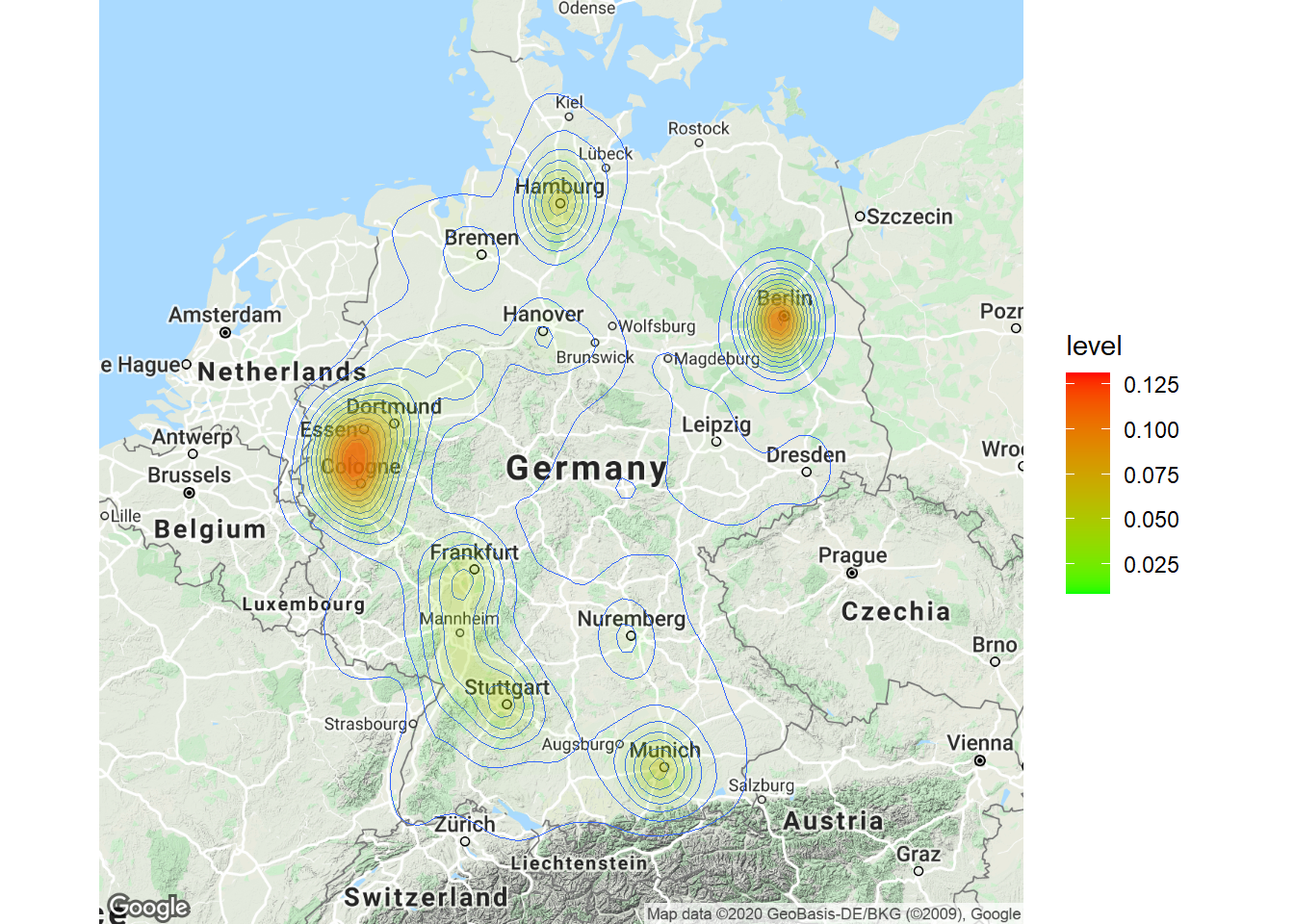
3.3 Writing reports using R-Markdown
This page will guide you through creating and editing R-Markdown documents. This is a useful tool for reporting your analysis (e.g. for homework assignments). Of course, there is also a cheat sheet for R-Markdown
3.3.1 Creating a new R-Markdown document
If an R-Markdown file was provided to you, open it with R-Studio and skip to step 4 after adding your answers.
Open R-Studio
Create a new R-Markdown document
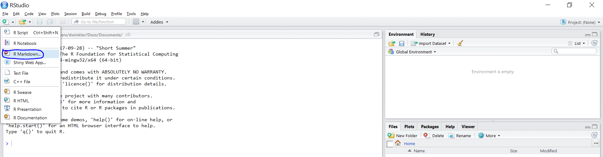
Save with appropriate name
3.1. Add your answers
3.2. Save again
“Knit” to HTML
Hand in appropriate file (ending in
.html) on learn@WU
3.3.2 Text and Equations
R-Markdown documents are plain text files that include both text and R-code. Using RStudio they can be converted (‘knitted’) to HTML or PDF files that include both the text and the results of the R-code. In fact this website is written using R-Markdown and RStudio. In order for RStudio to be able to interpret the document you have to use certain characters or combinations of characters when formatting text and including R-code to be evaluated. By default the document starts with the options for the text part. You can change the title, date, author and a few more advanced options.
First lines of an R-Markdown document
The default is text mode, meaning that lines in an Rmd document will be interpreted as text, unless specified otherwise.
3.3.2.1 Headings
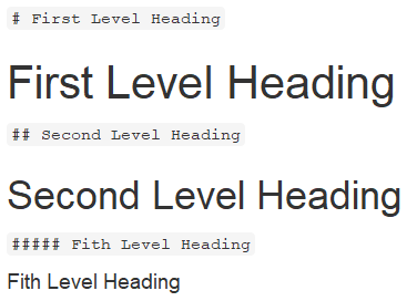
Usually you want to include some kind of heading to structure your text. A heading is created using # signs. A single # creates a first level heading, two ## a second level and so on.
It is important to note here that the # symbol means something different within the code chunks as opposed to outside of them. If you continue to put a # in front of all your regular text, it will all be interpreted as a first level heading, making your text very large.
3.3.2.2 Lists
Bullet point lists are created using *, + or -. Sub-items are created by indenting the item using 4 spaces or 2 tabs.
* First Item
* Second Item
    + first sub-item
        - first sub-sub-item
+ second sub-item- First Item
- Second Item
- first sub-item
- first sub-sub-item
- second sub-item
- first sub-item
Ordered lists can be created using numbers and letters. If you need sub-sub-items use A) instead of A. on the third level.
1. First item
    a. first sub-item
        A) first sub-sub-item
     b. second sub-item
2. Second item- First item
- first sub-item
- first sub-sub-item
- second sub-item
- first sub-item
- Second item
3.3.2.3 Text formatting
Text can be formatted in italics (*italics*) or bold (**bold**). In addition, you can ad block quotes with >
> Lorem ipsum dolor amet chillwave lomo ramps, four loko green juice messenger bag raclette forage offal shoreditch chartreuse austin. Slow-carb poutine meggings swag blog, pop-up salvia taxidermy bushwick freegan ugh poke.Lorem ipsum dolor amet chillwave lomo ramps, four loko green juice messenger bag raclette forage offal shoreditch chartreuse austin. Slow-carb poutine meggings swag blog, pop-up salvia taxidermy bushwick freegan ugh poke.
3.3.3 R-Code
R-code is contained in so called “chunks”. These chunks always start with three backticks and r in curly braces ({r} ) and end with three backticks ( ). Optionally, parameters can be added after the r to influence how a chunk behaves. Additionally, you can also give each chunk a name. Note that these have to be unique, otherwise R will refuse to knit your document.
3.3.3.1 Global and chunk options
The first chunk always looks as follows
```{r setup, include = FALSE}
knitr::opts_chunk$set(echo = TRUE)
```
It is added to the document automatically and sets options for all the following chunks. These options can be overwritten on a per-chunk basis.
Keep knitr::opts_chunk$set(echo = TRUE) to print your code to the document you will hand in. Changing it to knitr::opts_chunk$set(echo = FALSE) will not print your code by default. This can be changed on a per-chunk basis.
```{r cars, echo = FALSE}
summary(cars)

plot(dist~speed, cars)
```
## speed dist
## Min. : 4.0 Min. : 2.00
## 1st Qu.:12.0 1st Qu.: 26.00
## Median :15.0 Median : 36.00
## Mean :15.4 Mean : 42.98
## 3rd Qu.:19.0 3rd Qu.: 56.00
## Max. :25.0 Max. :120.00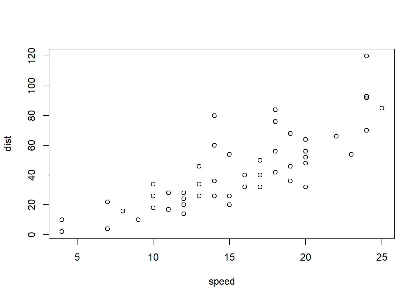
```{r cars2, echo = TRUE}
summary(cars)

plot(dist~speed, cars)
```## speed dist
## Min. : 4.0 Min. : 2.00
## 1st Qu.:12.0 1st Qu.: 26.00
## Median :15.0 Median : 36.00
## Mean :15.4 Mean : 42.98
## 3rd Qu.:19.0 3rd Qu.: 56.00
## Max. :25.0 Max. :120.00
A good overview of all available global/chunk options can be found here.
3.3.4 LaTeX Math
Writing well formatted mathematical formulae is done the same way as in LaTeX. Math mode is started and ended using $$.
$$
 f_1(\omega) = \frac{\sigma^2}{2 \pi},\ \omega \in[-\pi, \pi]
$$
\[ f_1(\omega) = \frac{\sigma^2}{2 \pi},\ \omega \in[-\pi, \pi] \]
(for those interested this is the spectral density of white noise)
Including inline mathematical notation is done with a single $ symbol.
${2\over3}$ of my code is inline.
\({2\over3}\) of my code is inline.
Take a look at this wikibook on Mathematics in LaTeX and this list of Greek letters and mathematical symbols if you are not familiar with LaTeX.
In order to write multi-line equations in the same math environment, use \\ after every line. In order to insert a space use a single \. To render text inside a math environment use \text{here is the text}. In order to align equations start with \begin{align} and place an & in each line at the point around which it should be aligned. Finally end with \end{align}
$$
\begin{align}
\text{First equation: }\ Y &= X \beta + \epsilon_y,\ \forall X \\
\text{Second equation: }\ X &= Z \gamma + \epsilon_x
\end{align}
$$
\[ \begin{align} \text{First equation: }\ Y &= X \beta + \epsilon_y,\ \forall X \\ \text{Second equation: }\ X &= Z \gamma + \epsilon_x \end{align} \]
3.3.4.1 Important symbols
| Symbol | Code |
|---|---|
| \(a^{2} + b\) |
a^{2} + b
|
| \(a^{2+b}\) |
a^{2+b}
|
| \(a_{1}\) |
a_{1}
|
| \(a \leq b\) |
a \leq b
|
| \(a \geq b\) |
a \geq b
|
| \(a \neq b\) |
a \neq b
|
| \(a \approx b\) |
a \approx b
|
| \(a \in (0,1)\) |
a \in (0,1)
|
| \(a \rightarrow \infty\) |
a \rightarrow \infty
|
| \(\frac{a}{b}\) |
\frac{a}{b}
|
| \(\frac{\partial a}{\partial b}\) |
\frac{\partial a}{\partial b}
|
| \(\sqrt{a}\) |
\sqrt{a}
|
| \(\sum_{i = 1}^{b} a_i\) |
\sum_{i = 1}^{b} a_i
|
| \(\int_{a}^b f(c) dc\) |
\int_{a}^b f(c) dc
|
| \(\prod_{i = 0}^b a_i\) |
\prod_{i = 0}^b a_i
|
| \(c \left( \sum_{i=1}^b a_i \right)\) |
c \left( \sum_{i=1}^b a_i \right)
|
The {} after _ and ^ are not strictly necessary if there is only one character in the sub-/superscript. However, in order to place multiple characters in the sub-/superscript they are necessary.
e.g.
| Symbol | Code |
|---|---|
| \(a^b = a^{b}\) |
a^b = a^{b}
|
| \(a^b+c \neq a^{b+c}\) |
a^b+c \neq a^{b+c}
|
| \(\sum_i a_i = \sum_{i} a_{i}\) |
\sum_i a_i = \sum_{i} a_{i}
|
| \(\sum_{i=1}^{b+c} a_i \neq \sum_i=1^b+c a_i\) |
\sum_{i=1}^{b+c} a_i \neq \sum_i=1^b+c a_i
|
3.3.4.2 Greek letters
Greek letters are preceded by a \ followed by their name ($\beta$ = \(\beta\)). In order to capitalize them simply capitalize the first letter of the name ($\Gamma$ = \(\Gamma\)).